The next time you’re at your office, take a look around you. What colour are the walls inside your building? Are they a plain, dull white that makes the environment look too sterile? Are they fun colours that match your brand? If you didn’t choose your commercial paint colours specifically with your staff in mind, you may be missing out on an incredible opportunity.
There are numerous different studies available on how paint colours affect people’s moods both at home and in the workplace. Certain colours can have a strong influence on the way people act when they’re in the presence of those colours. We’re sharing a few different ways you can enhance your work environment through different colours of commercial paints.
Yellow
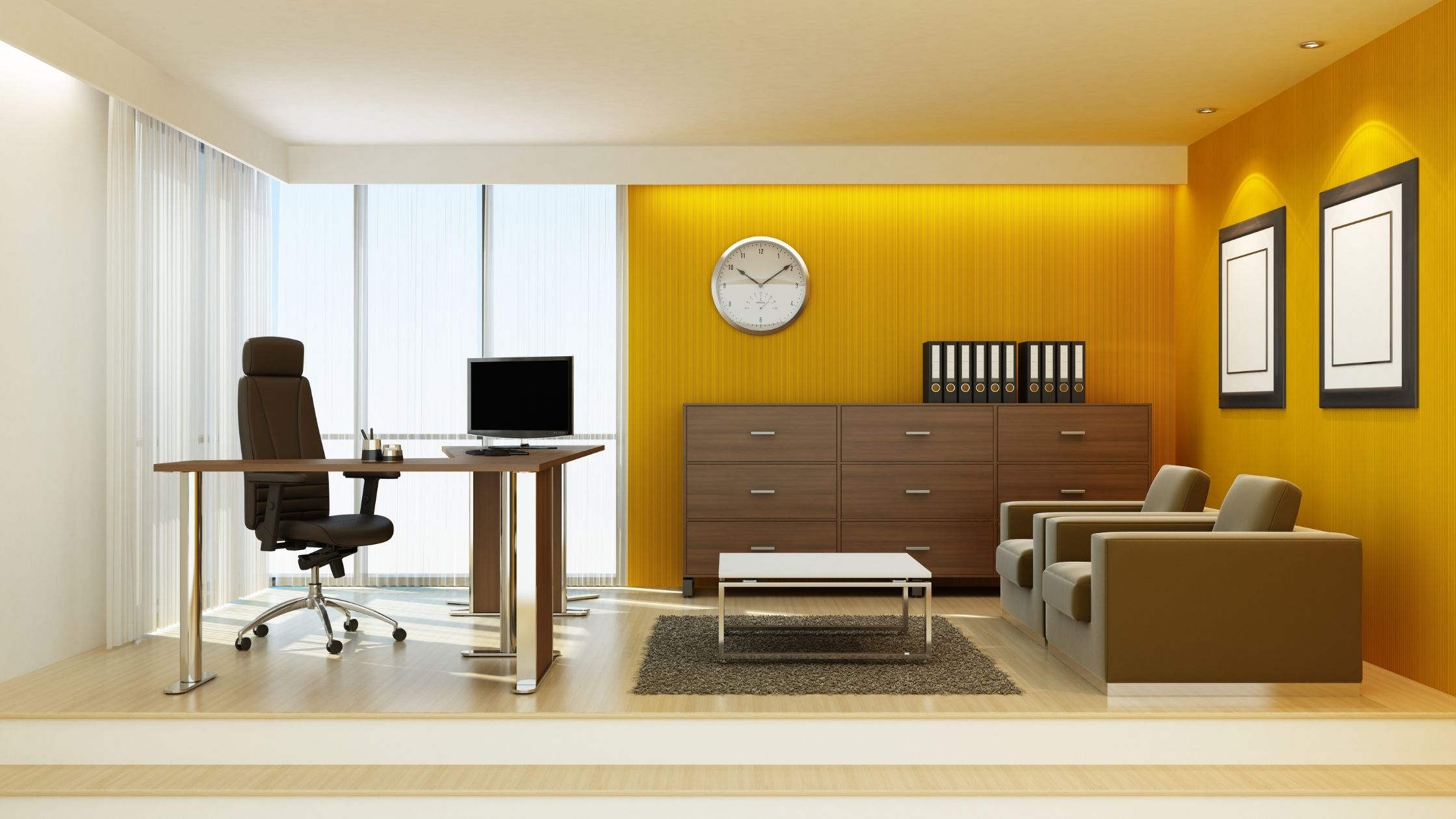
Yellow is a colour that helps to boost creativity, optimism, friendliness and self-esteem. If your business involves ideation and interaction with customers, then incorporating yellow is something to consider. The colour yellow works especially well if you’re in a creative industry such as writing, fashion, advertising, interior design or art-based businesses.
Orange
Orange helps to boost energy and enthusiasm in a workplace, but orange is often viewed as a loud colour. It’s best used for accents within your decor or as an accent wall rather than entire rooms. Painting certain areas of your building orange can help keep energy high during that mid-afternoon slump for your employees and help staff be more decisive during the work day.
Red Paint
Red is best used in fast-paced environments. Red can boost heart rates, evoke strong emotions and increase blood flow. Businesses with a fast-paced, high energy environment where time is of the essence would benefit from a splash of red. This colour is an especially good option for high-energy sales floors and areas where you need to attract attention. This tactic is commonly used in the restaurant industry to help get people in and out quickly.
Green
Green is a naturally calming colour which makes it a great choice for businesses where employees work longer hours. There’s a reason why in theatre performances the room is known as a “green room”. This is where actors and actresses hang out before the show to center their minds, calm their nerves and get ready for their performance.
If you’re considering hiring a commercial painter, green is an excellent colour for break rooms, lounge areas and waiting rooms so your staff and customers can calm their nerves.
Blue
Many experts say that blue is the most productive shade of paint available. Blue promotes a calming effect on people while stimulating mental activity. Having a commercial painting company update the interior of your business by painting your walls blue can help improve moods, attention span, productivity and efficiency in your workplace.
Are you ready to update your commercial building with a fresh coat of commercial paint? Get in touch with our team to schedule your consultation and let us help you select the best colour and shade to suit your business, your employees and your customers.

